
November 2024
Introduction
This is an app design I did for my Immersive Experiences class at Utah Valley University. In this class we were tasked with making an experience that could be enjoyed right here in Utah, an adventure themed app design. I decided to go an app based on the national park's here in Utah, since we have so many! Hiking and exploring the outdoors is a premiere activity here in Utah. I set out to research and understand what the solution could be.
Blueprint and research
I wanted to narrow down a few things about my Utah national park app. I gathered the following insights as I started to research, as well as research others that gave me influence like AllTrails and Strava.
Audience: Hikers or tourists interested in visiting the National Parks.
Channel: Mobile app - proof of concept in Figma.
Explanation: I think that this mobile app will be useful for tourists or hikers because it will give them insights about Utah’s national parks and why they should give them a visit. Overview of each National Park in Utah with key parts of the parks, including how busy they are, best times to go in the year, and what you should bring.
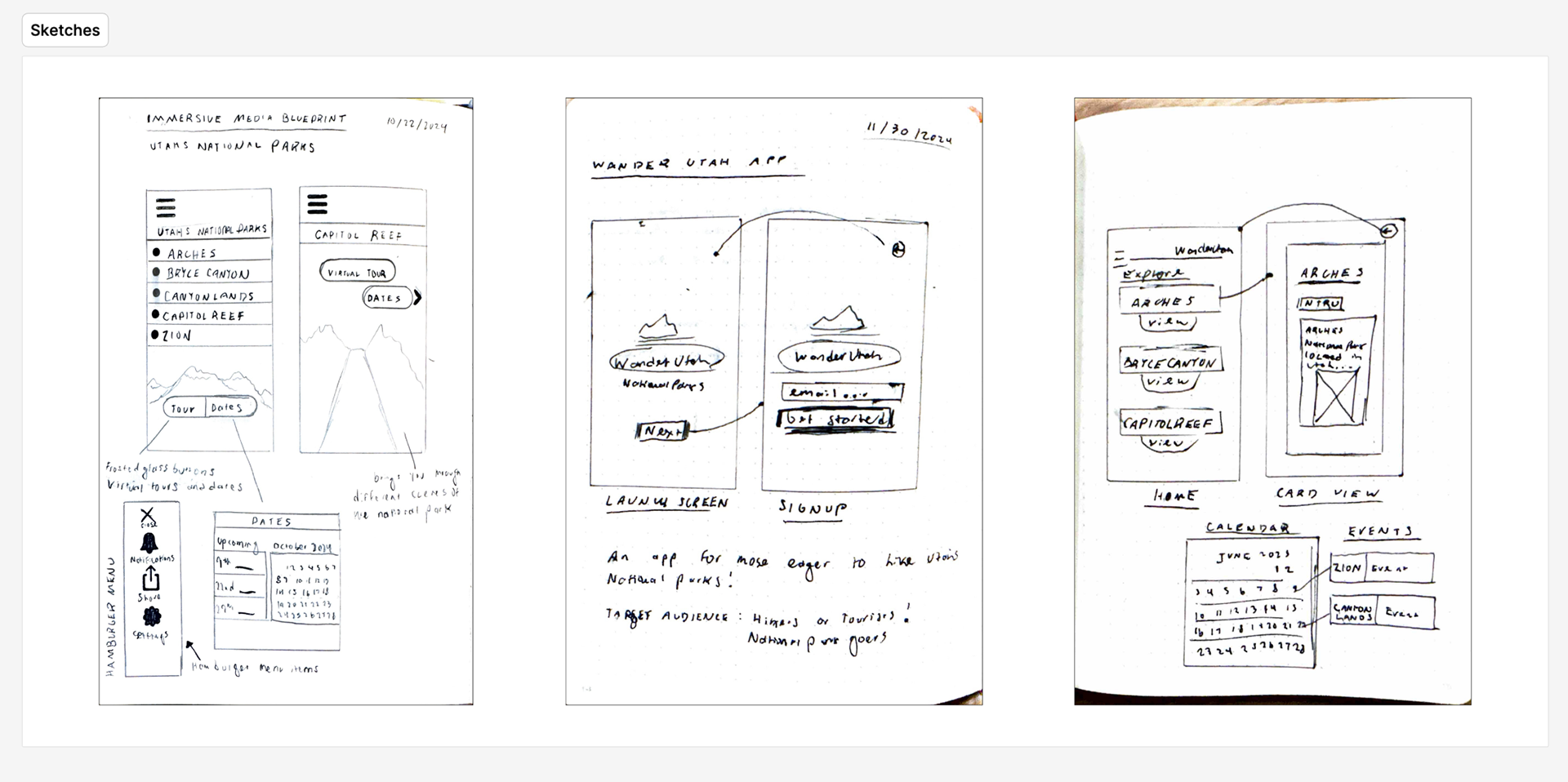
brainstorming and inital sketches
I wanted to come up with potential other ideas for my app and what I could do to deliver a unique user experience, as well as stand out among other national park or hiking apps. I wanted to do a featured community photo, where users could publish their favorite pictures in Utah's national parks and that picture could be showcased. This would let the users feel like they could have an impact on the app community - this originally was my virtual tour idea.
Naming
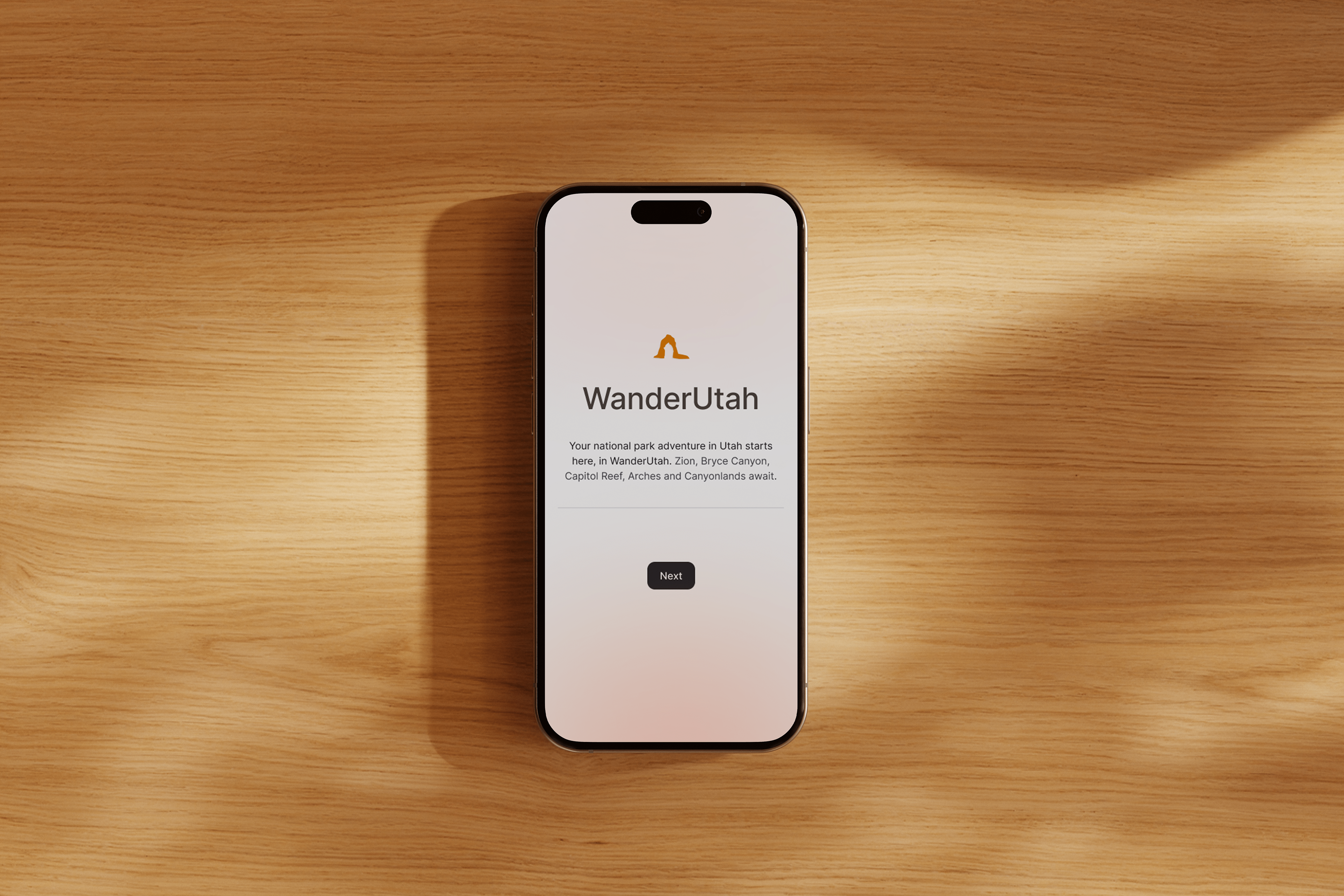
I also started to come up with names, and came to WanderUtah. I thought it was quite fitting as when you go to national parks, you do wander. I also like the word.
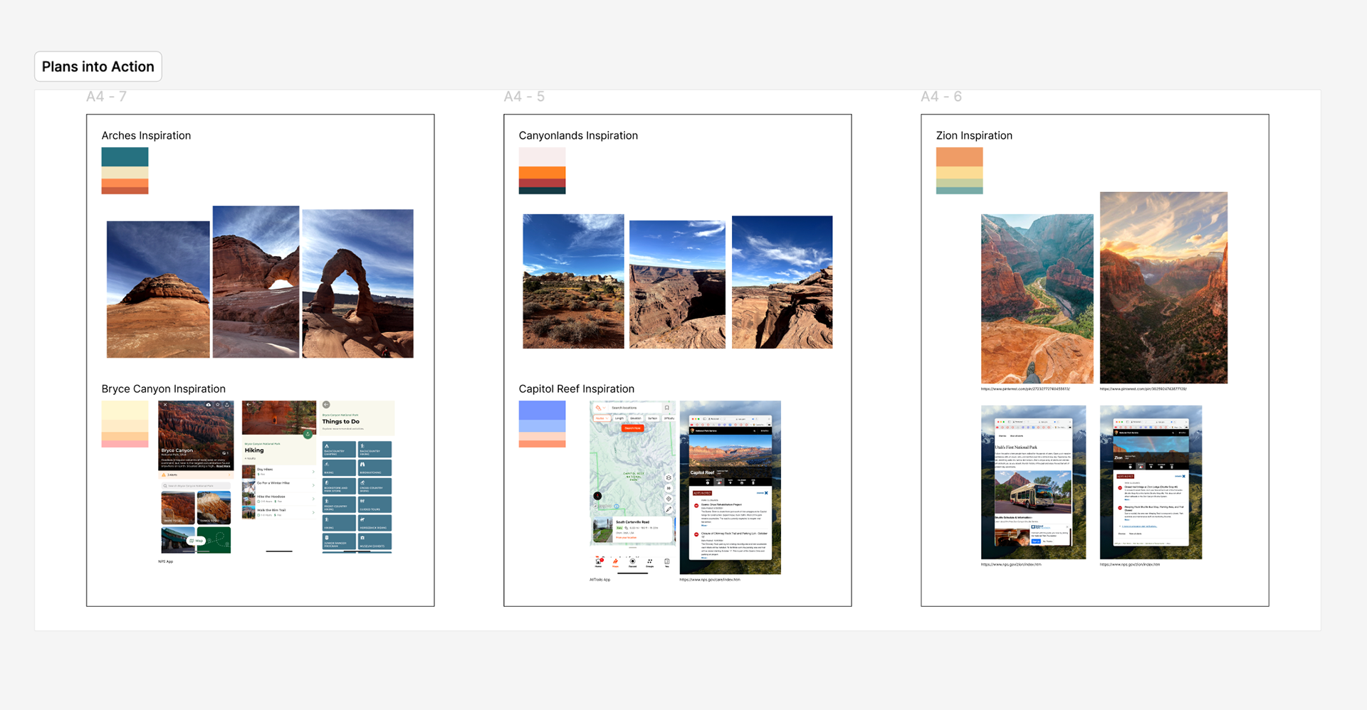
MOODBOARDS
I really wanted to narrow down the look and feel of every Utah national park, and I gathered a color palette as well as pictures of the parks as inspiration. I wanted to make sure every park in the app stood out and had it's own feel, so they wouldn't all be displayed being too similar and not have enough to differentiate them from each other.
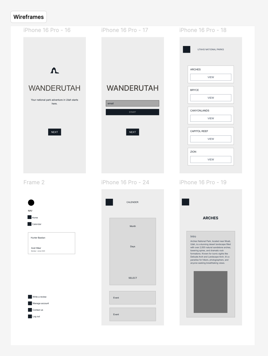
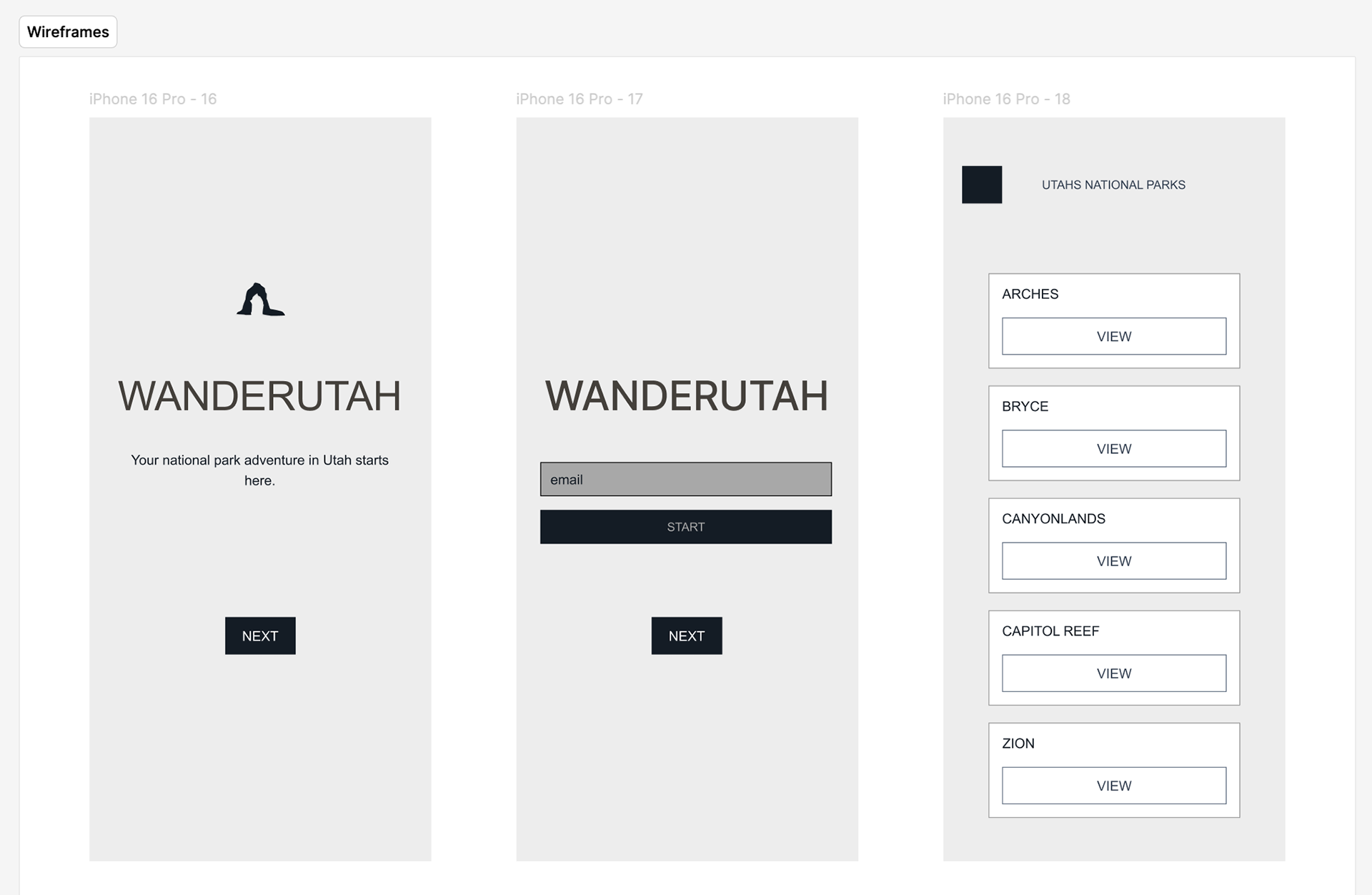
WIREFRAMES
When designing the wireframes, I really wanted to make references to my research that I found. I realized other apps don't have a lot of differentiation when they have different screens for different national parks, and I wanted to make that distinction. With my wireframes laid out, I wanted to continue to think of ways I could improve this experience and make something unique.
On the bottom right, I laid out an Utah's national parks screen and continued to think of ways to differentiate. I liked the overall direction I was going, but felt like I still needed more here.
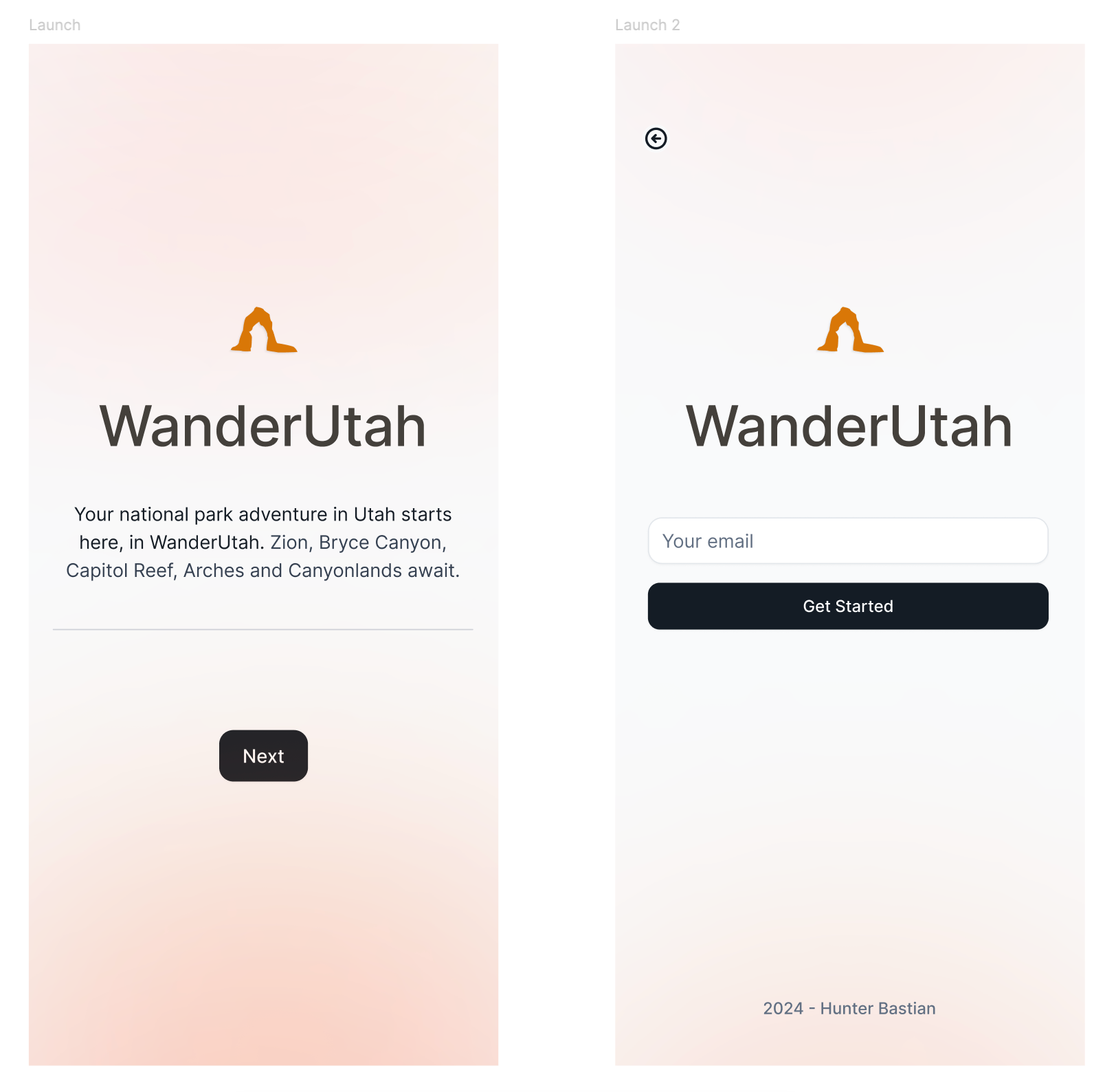
Launch screen
I worked out a good landing screen, and color palette I could relate to the national parks that could be used throughout the product. I wanted a clear path of where you should go to once you landed here, so you could start getting signed up right away to login.
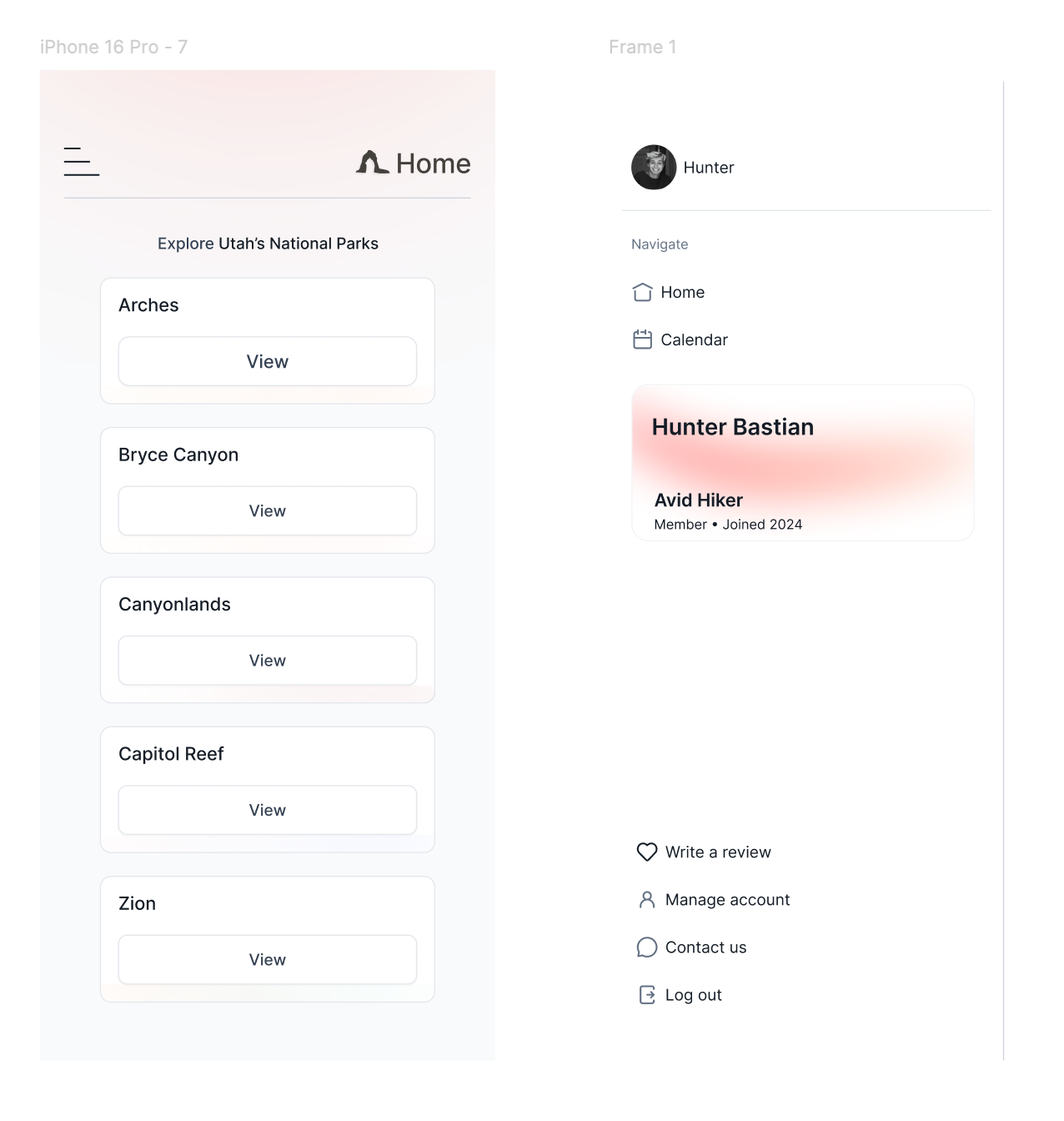
HOME AND SIDE MENU
Park Sections
One way I wanted to differentiate the parks was coloring their sections differently with the colors I themed around each park based on their pictures and color palette.
Side Menu
Where you can find home, calendar, reviews, account info, support and log out. I also was thinking this could also house your personal Utah badge, and show what you are - hiker, photographer... I also was thinking the more you used the app, you could upgrade this badge.
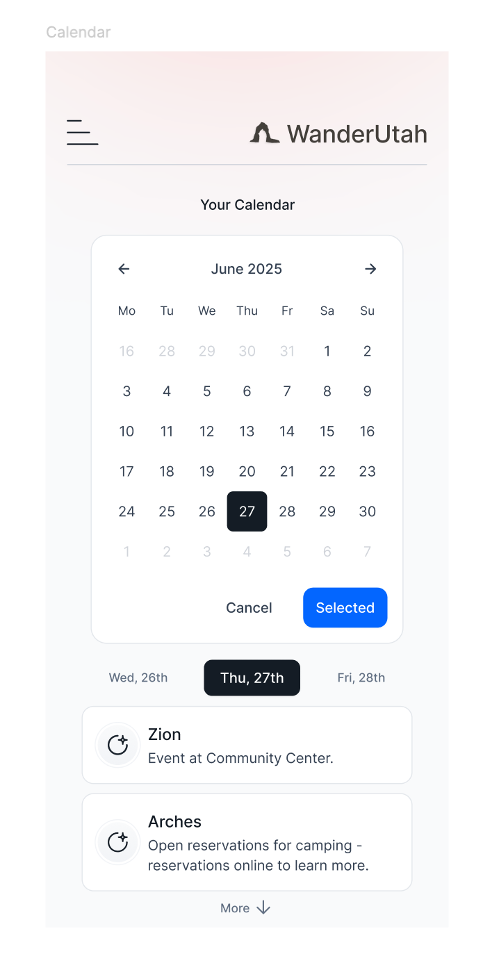
CALENDAR
For the calendar, I wanted it to be clear to the user what upcoming events were coming up as well as where they were located. Selecting a day can show you what events are coming up. around those days.
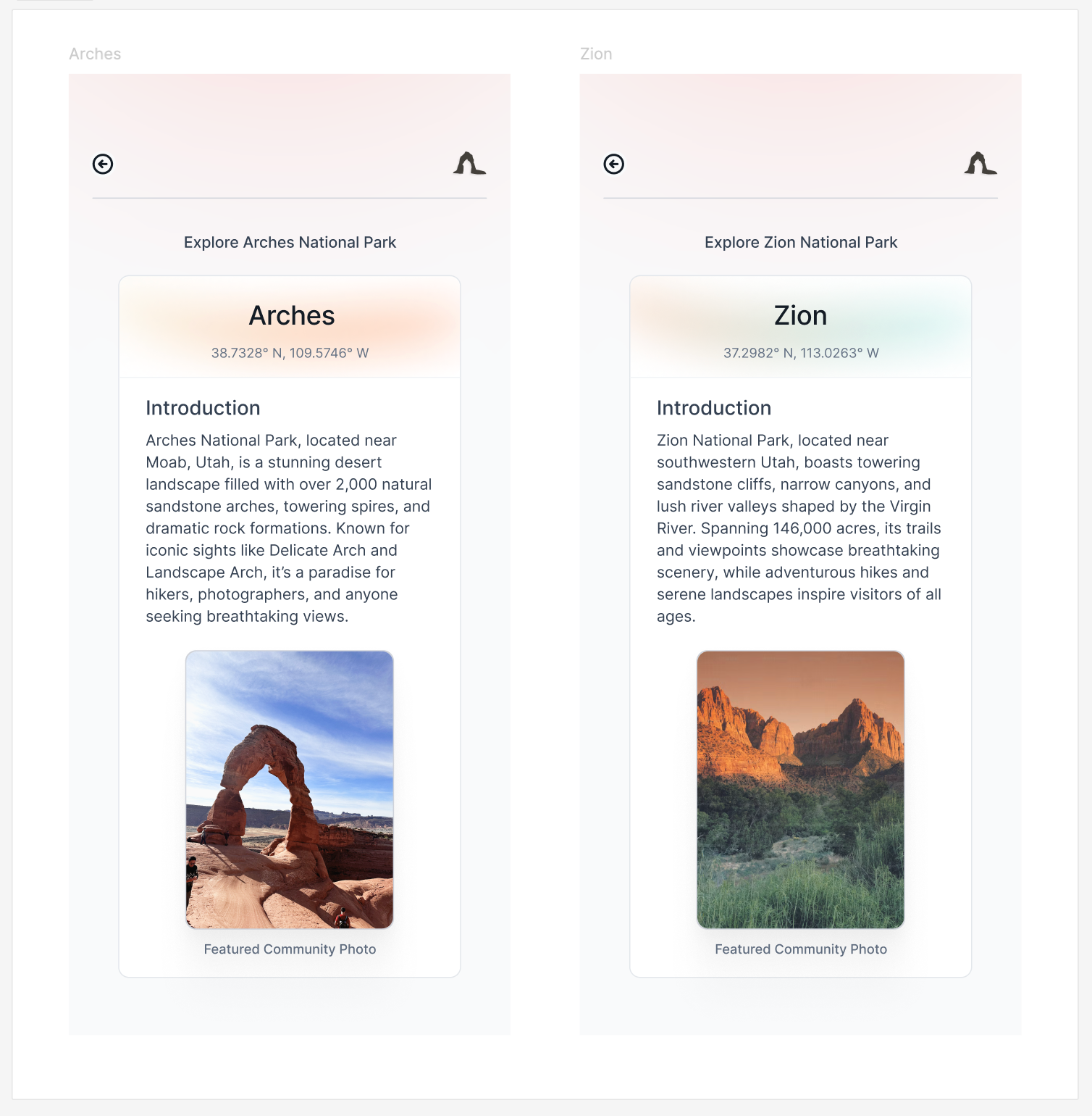
NATIONAL PARK CARDS
Each card for every Utah national park has it's own colors around the header, reflecting its color palette and the pictures of the parks. Arches reflects more of an orange, while Zion has more green and a darker orange.
Featured Community Photo
Each card features a community photo, and features highlighted pictures from the park.

CONCLUSION
How I wanted to use this app to help tourists
I designed this app to help people learn more about Utah's national parks and help them also learn about upcoming events happening at them. With an intuitive national park card system, personal badge and calendar with upcoming events, overall I think this app would be a great companion while visiting the parks.
Tools
I used my LEUCHTTURM sketchbook to get to the initial idea of WanderUtah, as well as Figma for UI design.